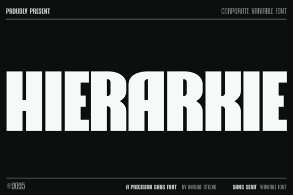
Hierarkie: A Structural Sans Serif for Digital Clarity
As a web designer who ships landing pages, refines SaaS UIs, and builds brand-aligned digital experiences, I reach for typefaces that do more than look good—they enforce intention. Hierarkie is one of those rare sans serif fonts that behaves like architecture: precise, legible, and unrelentingly purposeful. Built on Swiss design principles, it doesn’t just occupy space—it organizes it.
What makes Hierarkie stand out in real-world web use isn’t just its nine meticulously engineered weights—from Thin to Black—but how each weight holds its own at every size and context. On a hero banner at 84px? It commands attention without shouting. At 14px in a mobile navigation bar? It remains crisp, neutral, and fully legible—even on OLED screens. That consistency across scale is rare among modern sans serif fonts, especially those optimized for variable environments like responsive layouts and dark-mode interfaces.
I use Hierarkie most often where visual hierarchy must be instantly legible: hero section headlines, pricing cards, feature section headers, and CTA buttons. Its open apertures, balanced x-height, and restrained stroke contrast improve scanning behavior—critical for conversion-focused layouts. Users don’t pause to decode the type; they move straight to the message. That’s why it works so well for coaching websites with tight copy, product landing pages with dense benefit lists, or boutique online stores where clarity reinforces premium perception.
For branding, Hierarkie delivers tone without ornamentation. It reads as confident but not cold, structured but not sterile. Unlike many geometric sans serifs that feel clinical or rigid, Hierarkie’s subtle humanist touches—like its gently angled terminals and even rhythm in lowercase ‘a’, ‘e’, and ‘s’—add warmth while preserving authority. That balance makes it ideal for digital brand kits where typography anchors identity across web, email, and social media graphics.
On mobile, Hierarkie performs reliably. Its letterforms avoid excessive thinning in lighter weights, and its heavier cuts (Bold, Black) retain definition without bloating. I pair Thin or Light for subheadings over image overlays, and Medium or SemiBold for primary CTAs—even on 320px-wide viewports. For dark backgrounds, I default to Regular or Medium with slight letter-spacing (+0.25px) to prevent visual crowding. On light backgrounds, Thin or ExtraLight works beautifully for delicate section dividers or minimalist blog headers.
Font pairing is where Hierarkie shines as a structural anchor. Because it’s a highly functional sans serif font—not a decorative display font—I pair it with intention. For editorial sites or knowledge-based course platforms, I combine Hierarkie headings with a warm, readable serif font like Lora or Literata for body text. The contrast reinforces hierarchy while adding narrative texture. For tech or SaaS interfaces, I pair it with a neutral, highly legible sans serif font like Inter or IBM Plex Sans for UI labels and paragraph text—keeping the entire system within the same typographic family ethos.
It’s also effective as logo text—especially for brands prioritizing clean, scalable identity. Its consistent stroke modulation and generous spacing mean it renders cleanly at small sizes (favicon, app icon labels) and large (billboard banners, webinar slides). Just avoid using UltraLight or Thin for logos on low-res displays unless you’re serving high-DPR assets.
Hierarkie includes full Latin character sets, extended diacritics, and robust OpenType features—including stylistic alternates and case-sensitive forms—making it viable for multilingual websites, EU-facing SaaS dashboards, and global e-commerce storefronts. Webfont delivery is straightforward: WOFF2 files are included, and variable font support is available for advanced performance optimization. Always verify licensing before embedding—Hierarkie is a commercial font, and usage rights differ for client websites, white-labeled templates, online store themes, and digital product assets. If you’re shipping a Figma UI kit or selling Notion templates, ensure your license covers redistribution.
In practice, here’s how I deploy it across common projects:
- Creative portfolio site: Use Black for project titles, Medium for captions, and Light for footer credits—creating rhythm without visual fatigue.
- Boutique online store: Apply Bold for product names, Regular for short descriptions, and Thin for “Free Shipping” or “In Stock” badges—reinforcing trust through clarity.
- Coaching or course sales page: Reserve Black for headline promises (“Transform Your Workflow”), SemiBold for module titles, and Regular for benefit bullets—guiding users toward action.
- SaaS dashboard: Set Hierarkie Medium as the default heading font across all modals, tables, and sidebar nav items—ensuring UI cohesion without sacrificing readability.
One note on realism: Hierarkie isn’t designed for long-form body copy. Its personality is declarative, not conversational. Use it for headings, labels, and short impactful phrases—not paragraphs. Let your body font handle endurance; let Hierarkie handle emphasis.
Ultimately, Hierarkie supports what we aim for in every digital layout: order that feels intentional, not imposed. It doesn’t distract from content—it clarifies it. In an ecosystem crowded with decorative display fonts and overly casual sans serifs, Hierarkie stands as a reminder that strong typography doesn’t need embellishment. It needs precision, consistency, and quiet confidence. That’s why it’s become my go-to sans serif font for any project where structure serves strategy—and where every pixel must earn its place.